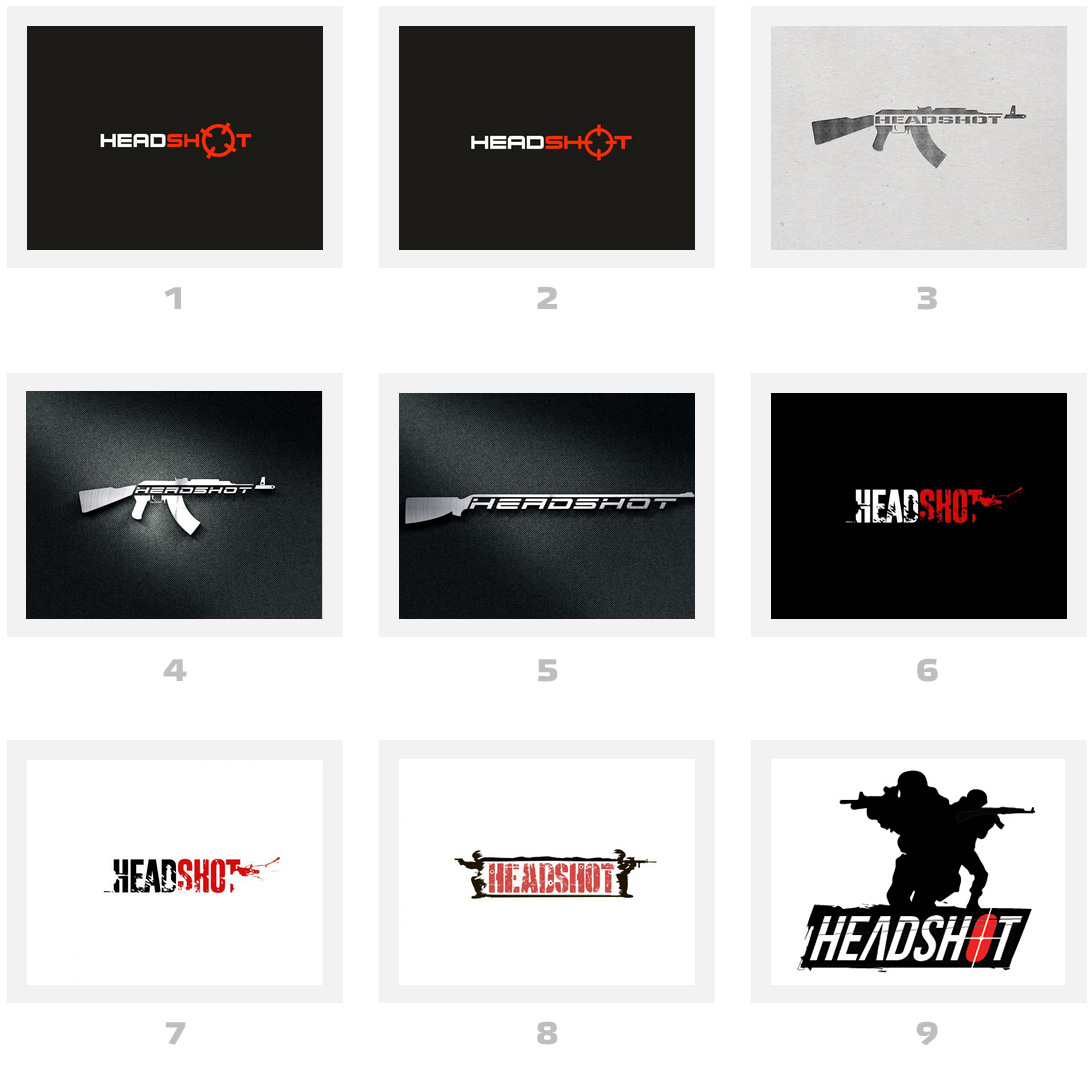
At first I was thinking it was for a website & then #2 best by far
For a game either #2 or a modified #8 with more of the gunmens bodies
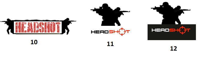
Personally I'd like something like #11 being cleaned up. I guess #12 (black) fits in better with a game case but white looks better for website e.g. you have the #2 logo (white or black) for website then add the soldiers for cd case
edit: actually you could just have #2 for logo (but white style) then throw whatever shit you want on the case (separate from logo)
well a logo isn't gonna sell any game so it's basically just which is most aesthetically pleasing & call it a day + get on with doing/finishing the actual game :d
1>3>2, but all of these three are decent. The rest I find meh. 9 is interesting, but you should maybe try to not make it look like CS that much. Maybe a crossover between 1 and 9 could be interesting?
